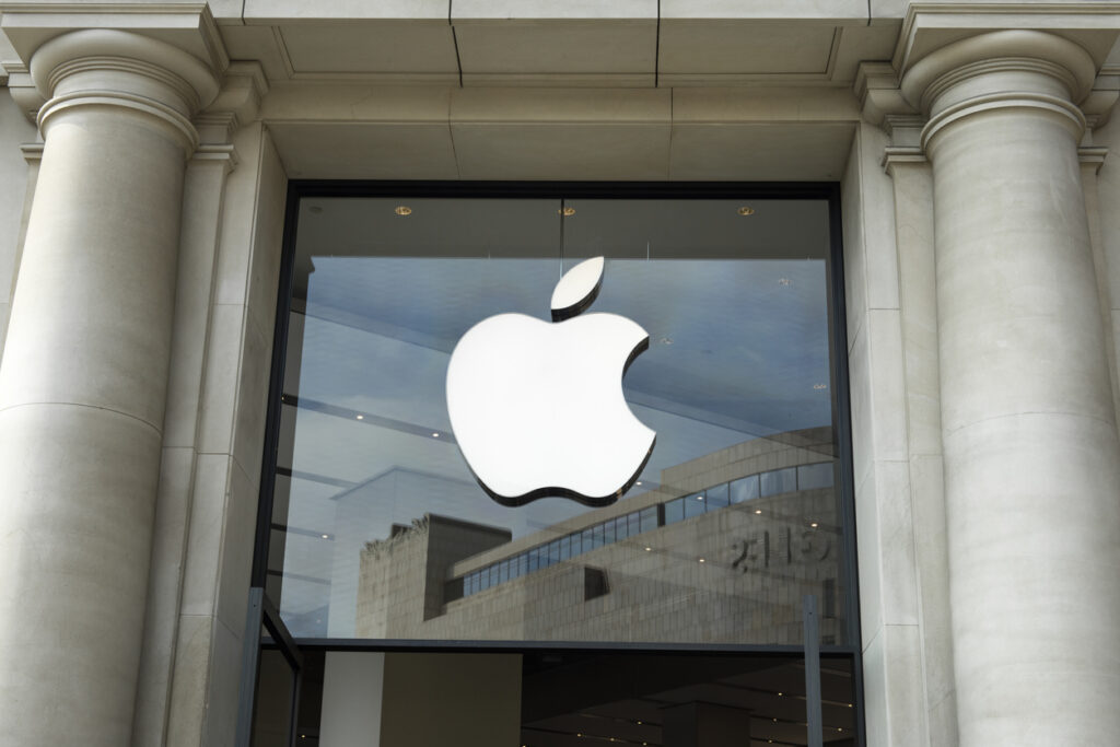
When graphic designer Rob Janoff first met with Steve Jobs in 1977, Apple Computer was still a seedling startup. Having been incorporated less than a year earlier, the company needed a logo to accompany the launch of its flagship product — the Apple II — at the West Coast Computer Fair. Janoff and fellow artist Carlos Pérez David were entrusted with the job. They understood the assignment — and ultimately helped create one of the most widely recognized brands on the globe today.
Based on examinations of cross-sections of real apples, Janoff created a bold, distinctive design: the rainbow-striped apple, with a big bite taken out of it. Jobs immediately approved the logo, now synonymous with the world’s most successful tech company, which is worth about $3 trillion today. Janoff then passed his concept to Pérez David, a junior designer at the same marketing firm, who illustrated the design by hand.
“It was my job to make it distinctive, to make it stand out, and it did,” Janoff said in an interview with The Lucas Show.
“It’s a great feeling. I do feel very fortunate,” Pérez David told NBC in 2011 of his involvement in the design.
The rainbow-striped apple emblazoned all the company’s products for 20 years and set the foundation for future logo variations. In 1998, the company swapped the rainbow stripes for a sleek, solid color as part of a brand overhaul before eventually transitioning to its present-day monochrome palette.
“One of the deep mysteries to me is our logo, the symbol of lust and knowledge, bitten into, all crossed with the colors of the rainbow in the wrong order. You couldn’t dream of a more appropriate logo: lust, knowledge, hope, and anarchy,” Jean Louis Gassée, an executive at Apple Computer from 1981 to 1990, said of his thoughts on the logo, according to Creative Bits.
Why the bite mark? Janoff told the site it adds “scale,” making it unmistakably an apple, as opposed to another fruit, like a cherry.
“Instantly, it had to say, ‘That’s an apple!’” said Pérez David in an interview with CBS News.
The rainbow stripes, Janoff told Creative Bits, were a nod to the Apple II being the first personal computer “that could reproduce images on the monitor in color.”
Janoff is widely known for his role in the logo’s creation and has since worked with other major companies, including IBM, Kleenex, Diners Club, Kraft, SC Johnson, and AT&T, according to his website.
Pérez David is renowned in the Bay Area and Latino community, CBS News reported, and has a place in the Mexican American Hall of Fame. But most people have no idea he helped create one of the world’s most famous logos. He told the publication he believes that’s partly because Latinos are often overlooked, and artists aren’t perceived as professionals.
But he doesn’t let that stand in his way.
“It gave me the life to get me where I’m at today,” he told the publication of his work. “It gave me that foundation, the roots of myself, and my culture, my family.”


Pingback: What is Apple Store Logos – Logomakershop Glossary
Pingback: รับแปลภาษา
Pingback: illustrated Christian devotional
Pingback: my420male
Pingback: ทัวร์ญี่ปุ่นส่วนตัว